Showing posts with label by location. Show all posts
Showing posts with label by location. Show all posts

Shira commissioned me last year to create a truly unique fine art ketubah for her. She and her husband-to-be Brian chose the Reform pledge for their wedding vows, and needed a ketubah that will enhance and respect the sentiment expressed therein. Like myself she sees a lot of symbolism in nature and wanted her ketubah to tell her and Brian's story and truly be a celebration of their lives and all their wishes and dreams.


Against a backdrop of Washington state nature scene I drew flora symbolic of healing and justice (to represent their chosen professions), added fruits of fertility and grace, and populated it with native creatures of strength, loyalty, nobility and love. Can you find them all? Together we created a picture of familial and romantic love and devotion, on par with their wedding vows. This special ketubah truly is swoon worthy!
It's a cherished privilege to bring brides and grooms' vision to life and I'm so honored to be part of the process. Sometimes it takes one or two revisions for my brides to clarify what they want, and sometimes we land it in one. In Shira and Brian's design process we went through a few small corrections, each one an improvement over the last, until we found the perfect representation of them.
I cannot express how much I love drawing woodland creatures ~ Deer! Bears! Otters! ~ The first design had larger than life otters, but Shira really loved the bears so I shifted focus to a family of papa bear, mama bear, and two cubs. I enjoy adding life to my scenes and I do admit I was sad to lose some of the critters along the way, but the final ketubah is so good you forget it was any different.

Wish you could have a ketubah like this one? I'm happy to announce a version of this ketubah is now available in the shop!
Once again, the magic of summer camp twinkles on: Shira chose her woodland wedding venue because it is where she went to summer camp growing up and decided then this magical place would be where she marries the love of her life.💫 The ketubah's artwork reflects the splendor of the woodland setting, and its exquisite craftsmanship is repeated still in the wedding gown and decor. The entire theme repeats in all details big and small - perfectly considered! The ketubah serves as a wonderful keepsake of this celebration, and all the couple have accomplished and will accomplish yet.


TESTIMONIALIt is GORGEOUS! It's even more beautiful in person. You truly made our vision come to life. Your detail and artistry is amazing! Thank you so, so much for creating such a lovely, meaningful piece that encompasses our commitment and love. It really is one of the highlights of our wedding!!

PRAISE FROM MOTHER OF THE BRIDEI love the design and craftsmanship. Thank you for creating such a lovely, meaningful ketubah. You integrated so many elements important to them: their love of nature and wilderness, their "home" in DC and Maryland, their commitment to medicine and law, even pomegranates. I really appreciated how you worked with us as we developed our ideas for the design, you were very patient.
I also want to thank you for taking a centuries-old Jewish tradition and modifying it so that it is appealing and meaningful to the current generation of Jewish young adults.
The ketubah held a place of honor at the wedding!
High praise indeed! A handful months later the bride's cousin also ordered a ketubah😊
If you too would like an artisan ketubah for your wedding ceremony or celebration,
please get in touch with me here.
please get in touch with me here.
| photographer Kir Tuben / @kir2ben
| wedding planner / day of coordinator Kristy Hartig
| venue Woodend Sanctuary

A Bounty of Wildflowers in the Catskills ~ custom papercut ketubah & client photos
February 21, 2020
"When we received our ketubah we just sat and stared at it. Absolutely thrilled doesn’t even begin to cover it!"
Ariel and Michael are nature enthusiasts who spent years hiking the Hudson Valley, Catskill Mountains, and Adirondacks of Upstate New York. They commissioned me to create a special ketubah that celebrates the untamed beauty of those places.

Ariel had a pretty good idea of the design brief but left the flowers pretty much up to me. I researched the flora that grows in the Catskills and what flower varieties symbolize health, happiness, fidelity, and more... and I poured all of it into this papercut!


C L I E N T P R A I S EWhen we received our ketubah we just sat and stared at it. Absolutely thrilled doesn’t even begin to cover it!We love the design and feel like it embodies our story!Thank you for making our vision a reality. It is beyond perfect!
If you’d like an artisan ketubah for your wedding ceremony or celebration,
please get in touch with me here.
please get in touch with me here.
| photographer @cristinagphoto
| wedding planner @chivintagewed
| florist @persephonefloral
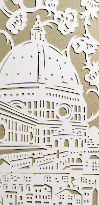

Even intimate celebrations are worthy of a cherished artwork to commemorate them. Such is the case with Alexandra & Shawn's destination wedding to Florence, Italy.
Alexandra was not my usual client as she wanted me to emphasize not nature but rather the spectacular man-made structures of Florence, Italy - namely the Duomo and Ponte Vecchio. From my past work you'd assume this is not in my wheelhouse, but now, Florence is my dream vacation destination! I'm an art history buff and the Italian Renaissance is my favorite art era so I understood why she wanted to feature them in her ketubah. I knew these buildings would carry my handmade style well and I was thrilled to have this little bit of Italy in my studio!
As with all custom orders, we delved deeper into the couple's vision for their ideal ketubah. After our 1-on-1 consultation we added more elements to the design: like the statue garden of the Four Seasons Hotel they'll be married at, the logo for the local restaurant where they'll be having their rehearsal dinner, the couple's initials, the bride's flowers, and the lace pattern of Alexandra's wedding gown. All in a white and gold color scheme worthy of a Medici. Or at least a modern descendant:)

FLORENCE IN LOVE
13X19 inches | Ivory, Gold Leaf
(click photo for best resolution)
________________________________________________________


My favorite detail of the design is the gate peeking from the tree foliage, which is the central gate in the hotel gardens. That's just the illustrator in my, though. The design went though several variations in my studio because I couldn't decide on the placement of the structures - each is such magnificent masterpiece in itself! But I made it in the end and sent it to the client who luckily quickly approved of my choice.
Because the ketubah will be flying from the US to Italy the bride asked me to have the text layer separate from the papercut layer, a request which also informed the design I created. It's sad for me that the entire piece will not get to bask in Italian sunshine, but no-checked-luggage is always best.
Because the ketubah will be flying from the US to Italy the bride asked me to have the text layer separate from the papercut layer, a request which also informed the design I created. It's sad for me that the entire piece will not get to bask in Italian sunshine, but no-checked-luggage is always best.

Looking back on the many commissions I did across the years, I spotted a trend in my papercuts. My papercuts were always lush in design but subtle in coloring but last year I noticed my papercuts had more details, more layers, more color - an evolution seen most clearly in this papercut for a wedding that took place earlier this year.
Alexi & Benjie actually contacted me after seeing another beach design I did for their friends, so they wanted something in that same grand scale with multiple layers only they wanted theirs in a lighter color palette. Somehow, from the client's wish for a sunset snapshot of Santa Barbara by the beach (emphasis on the ocean) and all the elements that make up their love story in the city, came out this 11 (that's ELEVEN!) layers colorful artwork. I surprised myself with this one!
 This commission couldn't have come at a better time, it was freezing where I lived and I needed to warm up. Santa Barbara looked like a Mediterranean beach town, and a papercut of it deserved all the light-catching colors in my stock.
Alexi & Benjie met fell in love in Santa Barbara. It is their home and a backdrop to their love story so I was worried about capturing it and and all the details that make it special to them, but after a few late night sessions with reality tv playing in the background inspiration struck and I think I did well.
I was lucky that Santa Barbara has Mediterranean architecture so I had a lot of familiar angles to pull from - including that of the sandy beach. The cobalt blue dome of the local Hillel center was a starting point, actually. I decided to frame the wedding text with driftwood after they shared with me that for their first date they went to the beach and sat on a log for seven hours talking (can you imagine that connection)! To balance out the cityscape on the right I filled the left portion of the papercut with sea life - from shells to sunset sailing - with the local fruit and flora bridging the gap top and bottom. Terracotta rooftops, bicycles, palm trees, and roses (Benjie likes to buy Alexi rose sculptures so they always have fresh flowers at the house) completed the design. I especially like the addition of the couple's silhouettes gazing at their vows.
 |  |

Holly & Will wanted their papercut ketubah to encompass their relationship across the years. It's a beautiful concept and oh my gosh we had a lot of pretty imagery to pull from! Holly gave me a list that included: lace, Chicago Musical Theater, castles, pumpkins, the Scottish Highland games, Superman, the ship necklace Will gave her, 'Safe in the Waves' motto, and more. A lot, right? Sounds random but she included a backstory and reason for every element to explain the emotional connection. The challenge for me was to pick and choose what to include and to create a cohesive composition that worked together not only aesthetically but also story-wise.
The two biggest elements I needed to feature were the bridge in Cedarburg, Wisconsin where the couple got engaged (Bill actually proposed to Holly there!) and a cutie-patootie otter couple (they mate for life!) - besides the ketubah text, of course;) Through their symbols - personal and universal - their love story needed to be told with a beginning, middle, and future. That the artwork came out so adorable is just a great bonus!

------------------------------------------------------------
OTTERLY LOVE YOU
18X24 inches | Super Gold, Charcoal
(click photo for best resolution)


From all the papercuts I did featuring state park forests I know it's a landscape that resonates with many -myself included!- and it's a challenge for me to create this response anew, without repeating myself. I believe I succeeded with this commission:

OUR FAVORITE HIKING SPOT16X22 inches | Ivory, Copper, Ivy, Charcoal(click photo for best resolution)

Our Favorite Hiking Spot is a 16X22 inches big papercut made out of four layers. It's a landscape design that draws you in - and to me is reminiscent of The Secret Garden imagery - a gateway to another world. The papercut is full of details from the different landscapes that brought Annie & Zach together - flowers and trees and mountains and bears. The illustration frames the text, but I think in this case the text is truly secondary to the intricacy and beauty of the papercut layers. It's one of those papercuts I like to say has hidden treasures, so the joy of viewing it extends with every new discovery. My personal favorite are the little mice!
 |  |


We started with a beach scene at sunset, but the design also features myriad of other elements big and small that symbolize different aspects of their life. For example, the lighthouse where they met, My Beloved verse, a hidden golf player's silhouette, and one detail that only they will understand is the golden book open on the sea-waves.


We tried many color combinations before they decided on their color scheme shown above - here are four examples. Which would you choose? (click images for bigger sizes)
 |  |  |  |

 A common trait those looking for a 'by location' design is that they love camping. Now I love the outdoors, but I'm not a camper. I would like to enjoy this activity, but I'm much more at home well... at home. A recent example of a design I did for a couple who loves to hike up mountains can be seen in the post on Quaker papercuts I wrote, namely the Olympic Mountains for a Washington state based couple. I'm so lucky to be getting design commissions for mountains and forests and rivers and animals, it's wild!
One of my favorite commissions of 2017 lives up to this theme. It was also a 'legacy' order (I believe is the right term): the bride's sister ordered a ketubah from me years earlier, and when her own wedding came she chose me for her ketubah as well! Jessica & Matthew are an outdoorsy couple who love to hike in the country's national parks. In fact, the starting point for this whole design was the breathtaking photo you see here to the side that they shot on their backpacking trip through the Glacier National Park in Montana. This shot of contentment in the splendor of nature guided me on the look of feel I wanted for their design. I tried to capture the wild essence of the place with its abundance of flora (I used their wedding flowers too!), as well as sneak in their hammock, dog, and a little bit of ahava (love). It is simply, effortlessly, one of the more gorgeous designs I pulled off this year.


LET'S MEET AT THE PARK
16X16 inches | Mercury & Midnight Blue
(click photo for best resolution)
-------------------------------------------------------
While editing the photos for this post (which are beautiful, scroll down to find the link for more), I found these two photos of designs from years past, which fit this post's theme and also show the different takes of 'by location' design:
|
|


ROCKY POINT ISLAND | Rocky Point Island in Australia was where Michelle & Timothy were getting married, and they wanted a design that would depict their wedding venue, iconic bridge and all.
Subscribe to:
Posts (Atom)


Social Icons